23,833 Ceramics at The Met: What the Data Shows
1. How it started
In an art history class I took, we spent a few weeks on clay. We learned four body types: earthenware, stoneware, porcelain, and fritware. Each one uses different clay, is fired at a different temperature, and comes from different places.
Around the same time, I found out that The Met publishes its whole collection as open data. It looked like fun data to clean up and study, so I tried it.
I filtered the data down to ceramics. That left me with 23,833 objects from 44 countries. Every object has a date. Most have a place. Each one also has a short text description of what it is made of. I spent a while turning those descriptions into columns that I could put on a map.
Here is the result. Every country in the collection, shaded by how many ceramic objects it holds:
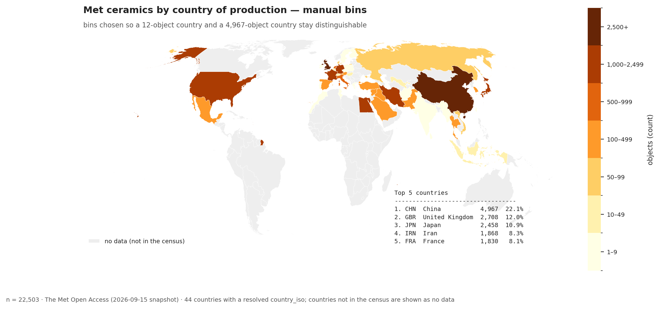
China is far ahead of everything else. The top five countries — China, Britain, Japan, Iran, and France — hold 61.5% of the collection between them.
2. Checking the reading against the data
Testing a claim from the reading
The thing that started all of this was a claim in one of the course readings. Sequoia Miller’s introduction to Ceramic Art tells the history of porcelain as a history of imitation, and it is specific enough to check:
- Porcelain is Chinese, and it is old. It “originated in the seventh century,” and was “exported from about the ninth century on, reaching South Asia, the Middle East, and the east coast of Africa.”
- Potters elsewhere spent centuries trying to make something like it. “Early efforts by Middle Eastern potters to replicate porcelain gave rise to faience… and a ceramic body called fritware.” Fritware’s “particular luminosity echoes the glassiness and translucency of true porcelain.”
- Europe tried the same thing and failed for a long time. European potters used a tin glaze to fake the white surface, and did not work out real porcelain until 1709–10.
Rawson puts it more bluntly: hard-paste porcelain “was what European potters long tried to imitate without knowing what the true ingredients were” (Rawson 1984; Miller 2023).
One source, everyone else imitating. That account has dates in it, and I had 23,833 dated objects, so I could see whether the collection looked like that. I split it into seven groups — one for each step — and counted objects per century.
They appear in this order in the Met data, which is not the same as the order they appeared in history.
The column is not the date of the oldest object. It marks the century when each group starts showing up in real numbers (the first century that holds at least 5% of everything in that group):
| step | becomes common in the data |
|---|---|
| Islamic tin-glazed earthenware | 700s |
| Islamic fritware | 1000s |
| Islamic underglaze painting, on fritware | 1100s |
| Chinese porcelain, underglaze | 1400s |
| European tin-glazed earthenware | 1400s |
| Japanese & Korean porcelain | 1600s |
| European porcelain | 1700s |
The difference matters. Chinese porcelain is in this collection from the 600s, but it does not become common until the 1400s, simply because so much more of it was made later. So the table shows when each group becomes common here — not when anyone invented it.
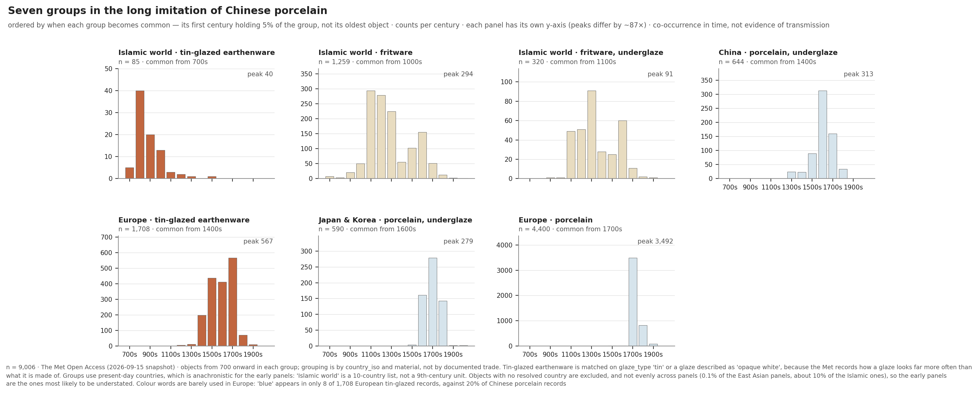
Each panel is one step in the table. Note that every panel has its own y-axis. The tallest bar in the last panel is 3,492 objects; the tallest in the first panel is 40. So you cannot compare the panels by height.
Where the data agrees with Miller. The European half lines up almost exactly. European tin-glazed earthenware becomes common in the 1400s. European porcelain does not arrive until the 1700s. Three hundred years sit between them, and that gap is the technical limit Miller describes: a tin glaze puts a white, opaque surface over a cheap tan clay body, which is what you do when you cannot make a white body. Europe only solved the real recipe in 1709–10, when alchemists working for Augustus the Strong of Saxony worked it out; the Meissen factory opened in 1710 as Europe’s first hard-paste manufactory. That is a technical limitation you can actually see as a gap between two bar charts, which I enjoyed more than I expected to.
The Islamic half fits too, once you notice that tin glaze was not a European idea. Miller places its development in the Middle East in the 800s or 900s, and in this collection Islamic tin-glazed earthenware becomes common in the 700s — the earliest group in the whole figure, centuries before anyone in Europe tried the same trick.
That is slightly earlier than Miller’s date, and I would not make much of the gap. It rests on five objects, and the Met dates all five of them to the “8th–9th century.” I bucket a date range by where it starts, so those five land in the 700s — but they would sit in the 800s just as easily, which is Miller’s window. My filter also matches a glaze by how someone described it, not by chemical analysis: “opaque white glaze” is a curator’s phrase, not a lab result. So the chart and the reading are not really disagreeing here.
Finding that group takes one small adjustment. Tin glaze is easiest to match on the glaze_type
field, but that field records what a glaze is made of, and all 215 records that say “opaque white
glaze” leave it empty. Matching on how the glaze looks as well finds 85 Islamic objects instead of
19. Among them are five 9th-century Iraqi pieces described as Earthenware; in-glaze painted in blue on opaque white glaze — cobalt blue on a white ground, in the 800s, which is roughly where most
accounts say blue-and-white begins.
What the data cannot settle. Miller’s account runs one direction: China makes porcelain, everyone else imitates. My data does not contradict that. But it does place underglaze painting on fritware in the 1100s, three centuries before Chinese blue-and-white becomes common here — an ordering his essay simply does not discuss. Whether influence also ran back toward China is a real question in the scholarship, and it is one this dataset cannot answer. These columns record where and when an object was made. They do not record who saw what.
I should also be careful with that word blue. Only 27% of the Islamic underglaze records mention a colour at all, and most of those that do are polychrome. So the honest version is that the technique of painting under the glaze shows up early in the Islamic world — not that Islamic blue-and-white came first.
You can often guess the country from the glaze color
I did not expect this one at all.
The Met usually does not record what a glaze is made of. Instead it records what the glaze looks like: “transparent glaze,” “celadon glaze,” “turquoise glaze.” I pulled those descriptions into a new column. I ended up with 23 terms. Then I checked which countries each term came from.
Some terms belong almost completely to one country:
- peachbloom — 100% China (75 of 75 objects)
- oxblood — 100% China (24 of 24)
- copper red — 98% China (55 of 56)
- mottled — 94% Japan
- cream white — 93% Thailand
- crackled — 74% Japan. The other 26% is China. No other country uses this word.
But the more interesting terms are the ones that do not belong to a single country:
- blue — Japan 56%, China 33%
- celadon — China 48%, Korea 35%, Japan 16%
- turquoise — Iran 39%, Syria 33%, China 25%
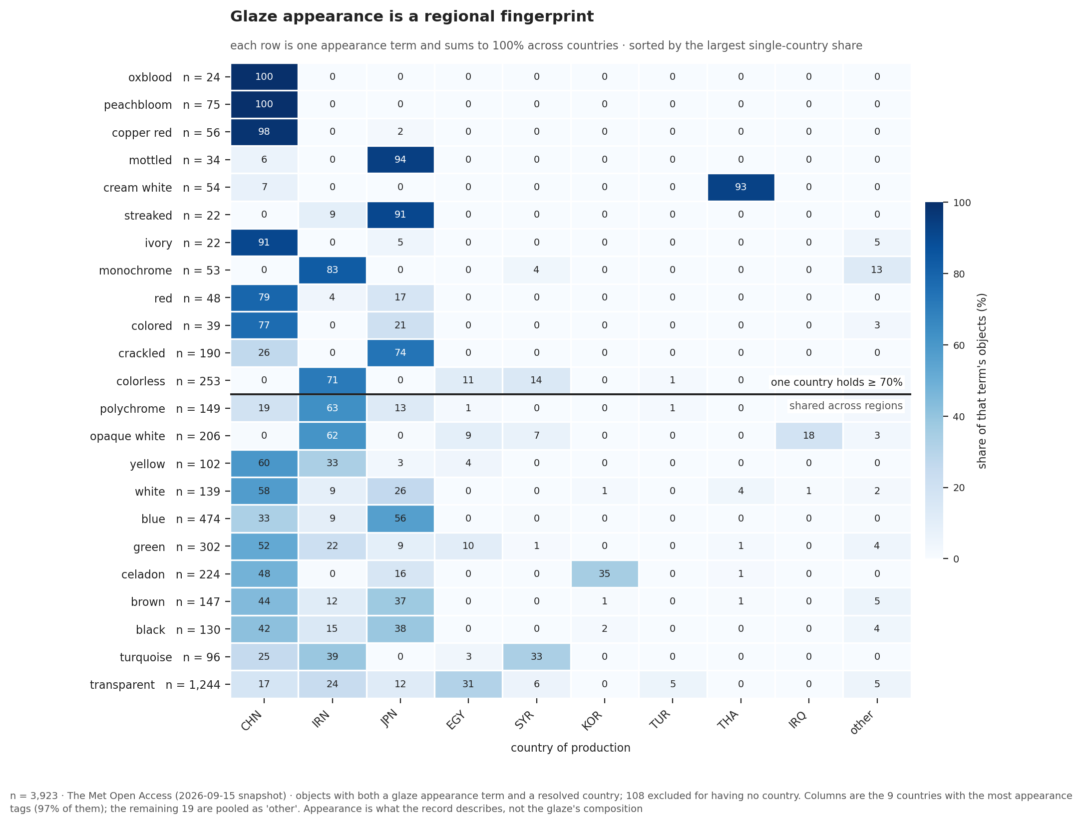
The chart sorts every term by how concentrated it is. Terms that belong to one country rise to the top. Terms shared across a region fall below the line.
That difference is what interests me. A term used in only one country looks like a local specialty. A term shared across several regions may show techniques and styles that traveled between them.
But I have to be careful here. A shared term could also mean that two regions developed the same technique separately. Or that objects were traded. Or simply that two curators chose the same English word. I cannot tell these apart with this data. It also helps to remember what is really in this column: description text, not chemical analysis. Two objects both called “celadon” were not necessarily made the same way.
Still, those three are not split at random. Each one reaches across exactly the regions section 2 was about. Blue is shared by Japan and China — two of the panels in that chart, and the colour both of them were painting with. Celadon belongs to three East Asian neighbours and essentially nobody else. Turquoise belongs to the Islamic world, and to China again.
Section 2 looked at imitation as a sequence in time: who was making what, century by century. This is the same question from a different angle — which words end up describing objects from more than one place. Terms that reach across neighbouring regions are consistent with exchange, although this dataset cannot tell whether what moved was a technique, an object, a style, or simply cataloging vocabulary.
Still, it is a second measurement pointing the same way as the first, and it comes from a different column of the same spreadsheet.
One more thing. The most common term of all is “transparent” (1,244 objects), and it is useless for this purpose. Its top country is Egypt, at only 31%. The most frequent word turned out to be the least useful one.
3. Then some things looked strange
85% of Iraq’s ceramics are broken pieces
I made a chart showing how often an object’s name contains the word “fragment” or “sherd.” (A sherd is a broken piece of pottery.) I expected the chart to tell me something about which materials break easily.
It does not. It tells me something about how the museum got the objects.
| country | fragments |
|---|---|
| Iraq | 84.8% |
| Syria | 42.8% |
| Egypt | 38.4% |
| Iran | 32.5% |
| China | 1.3% |
| Japan, Germany, Britain, USA | 0.0% |
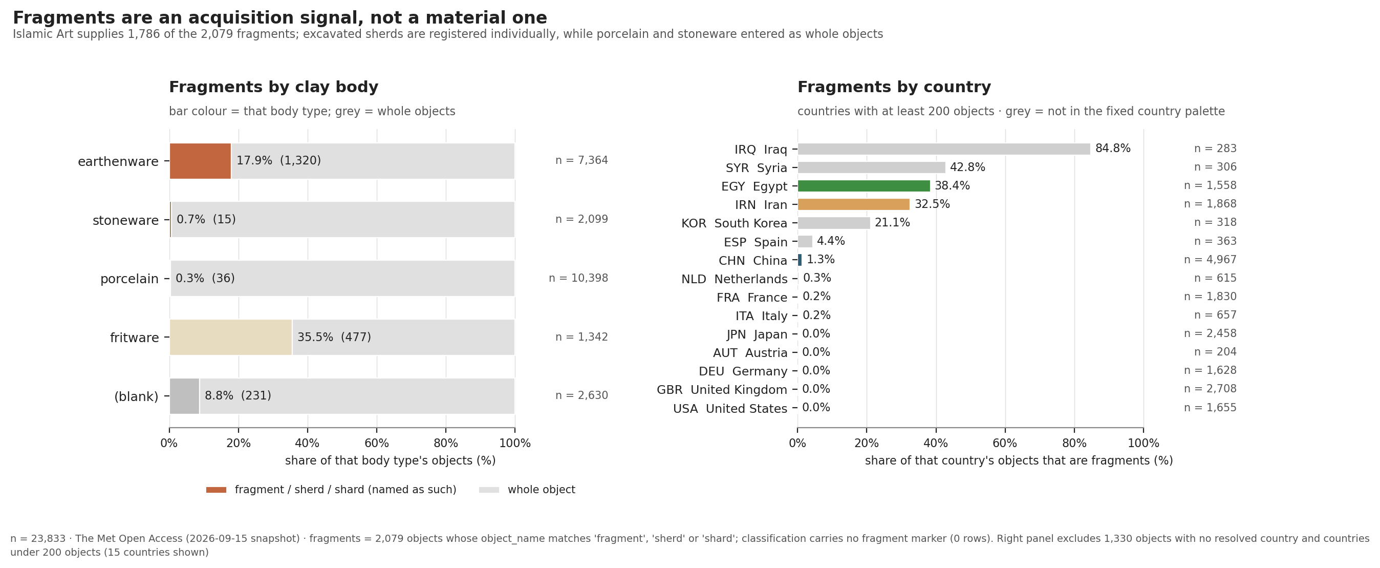
Iraqi pottery is not 65 times more fragile than Chinese pottery. So the difference is probably about how the objects reached New York.
I want to be clear that the next part is my interpretation, not a fact from the data. My guess is that most Iraqi material came from archaeological digs, where every broken piece is recorded as a separate object. Chinese and European porcelain probably came from art dealers and private gifts, which usually means complete objects.
I tried to check this, and I failed in an interesting way. The data has a Credit Line field and an
Excavation field. Together they should answer the question. But the Excavation field is empty for
all 23,833 objects. And not one credit line in the whole collection contains the word “excavation.”
The credit lines do show one useful pattern. 168 of Iraq’s 240 fragments arrived in a single acquisition in 1932, and another 42 arrived in 1923. Material from an expedition would arrive in large batches like this. So the pattern fits my guess. But “it fits” is not the same as “it is proven.”
One thing I can say with confidence: the fragments are concentrated in one department. 1,786 of the 2,079 fragments belong to Islamic Art. So a chart I built to measure materials ended up measuring collecting history instead. I just cannot prove the exact reason from this data alone.
The data peaks in the 1700s, but production probably peaked later
When I count objects by century, the 1700s is the largest period by far:
1600s   2,111
1700s   8,150   ← peak
1800s   4,419
1900s+    775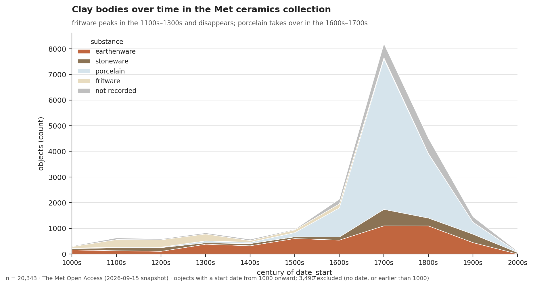
The same centuries, split by clay body. The pale band that swells in the 1700s is porcelain: 56.3% of all the porcelain in the collection sits in that one century. (This chart also counts objects with no recorded country, so its totals run a little higher than the numbers above.)
Industrial ceramic production in the 1800s was almost certainly larger than anything in the 1700s. I know that from outside this dataset, though. The chart itself does not show it. So why does the data peak one century earlier?
Because this is not a record of production. It is a record of collecting. The peak probably shows collecting and trade history more than it shows total world production. One likely reason is the huge 18th-century trade in Asian porcelain to Europe. And 56.3% of all the porcelain in this collection does come from that single century. But I have not traced where each object came from, so I cannot say how much of the peak this explains.
(Here is a nice detail, from The Met’s own essay on export porcelain: porcelain was often stored at the lowest level of the ships, both to provide ballast and because it was impervious to water — in contrast to the even more expensive tea stored above it. Porcelain was cargo and ballast at the same time.)
European records almost never say “blue”
I wanted to make a chart about blue-and-white ware, so I tried to filter the data by color. I could not.
Out of 1,704 European tin-glazed earthenware objects, only 8 mention the word “blue” — that is 0.5%. Chinese porcelain records, by comparison, mention “blue” 757 times out of 3,793 objects (20%).
Europe did not stop making blue-and-white ware. This suggests that different departments use different cataloging conventions.
I should be careful about the exact cause, though. These two groups differ in department and in material: European tin-glazed earthenware versus Chinese porcelain. I cannot separate those two factors with this data. But the effect on my work was the same either way. The objects have the feature. The catalog just does not have the word.
This turned out to be a pattern, not an exception. Here is how often decoration technique is missing, by department:
| department | decoration not recorded |
|---|---|
| The American Wing | 90.9% |
| Medieval Art | 78.2% |
| European Sculpture & Decorative Arts | 69.3% |
| Asian Art | 27.4% |
| Islamic Art | 8.9% |
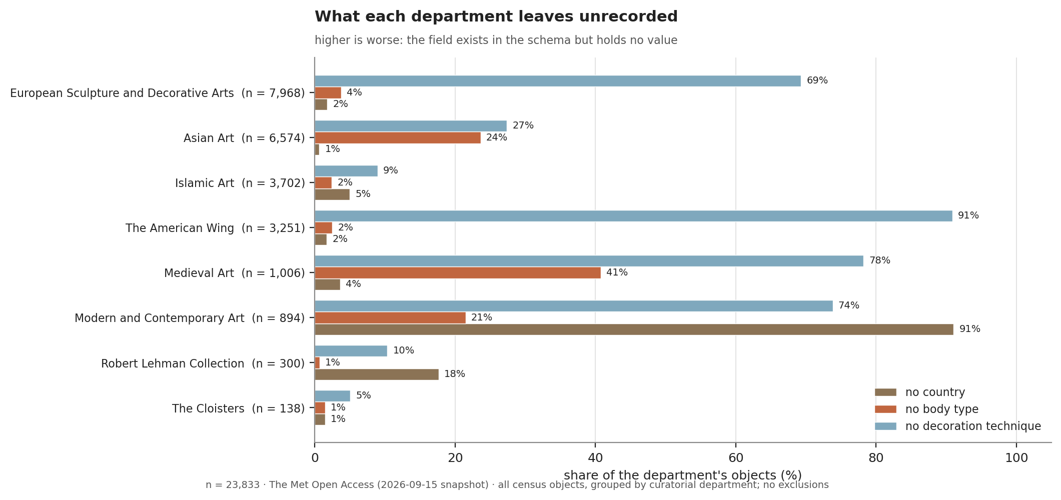
The chart adds two more measures to the same departments: how often the country is missing, and how often the body type is missing.
The same object can leave behind very different amounts of information, depending on which department recorded it. Japanese ceramics are a good example. 38.7% have no recorded body type at all.
This may partly reflect cataloging history. Many of these objects entered the collection between the
1890s and the 1930s, and they use broad terms such as clay, pottery, and faience. The accession
dates fit this pattern: among Japanese objects acquired before 1940, about 53% have no body type.
Among those acquired after 1970, the figure is under 6%.
So the blanks are not random. They group together by department. And for body type, they also group by the decade when the museum acquired the object.
4. Wrapping up
The idea I keep returning to is that a museum collection holds two histories at the same time.
The first is the history of ceramics. That history is real, and you can genuinely see it in this data, in the imitation story and in the regional glaze colors.
The second is the history of what one museum in New York happened to collect, and how its curators happened to write it down.
You cannot read the first history without also thinking about the second one. In museum data, “not recorded” is not the same thing as “did not exist.”
But honestly, the best part was simpler than all of that. A reading assigned for a class said that Europe spent centuries trying to copy Chinese porcelain and could not manage it until the 1700s. Then a bar chart I built from a museum spreadsheet said the same thing back to me.
That felt good.
Appendix: a few more charts
Six figures appear in the post above. Here are nine more, with one line of explanation each.
Where things were made
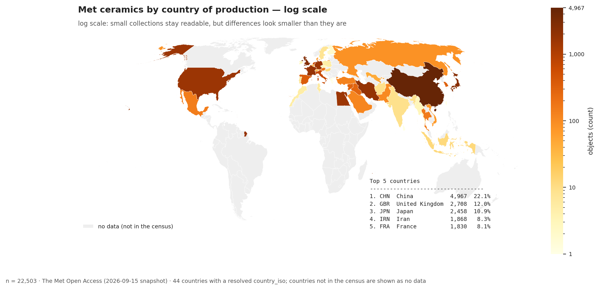 fig01b — objects per country, log scale. Small collections become visible, but a 400× difference now looks like only three steps. The labeled-bin version of the same map is the one in section 1.
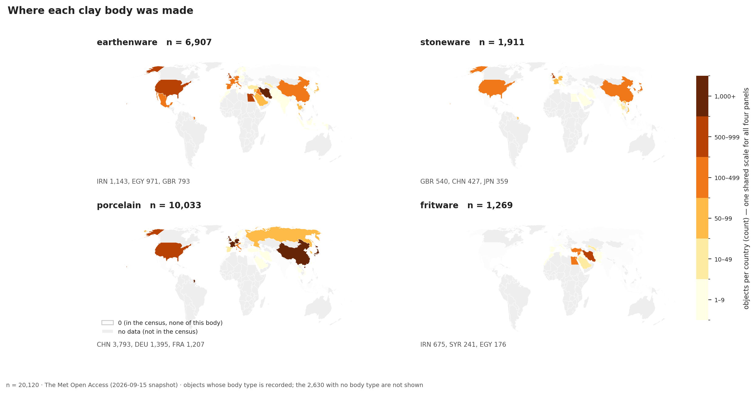 fig01d — all four clay bodies together. Every panel uses the same color groups, so you can compare them directly.
What each country’s ceramics are made of
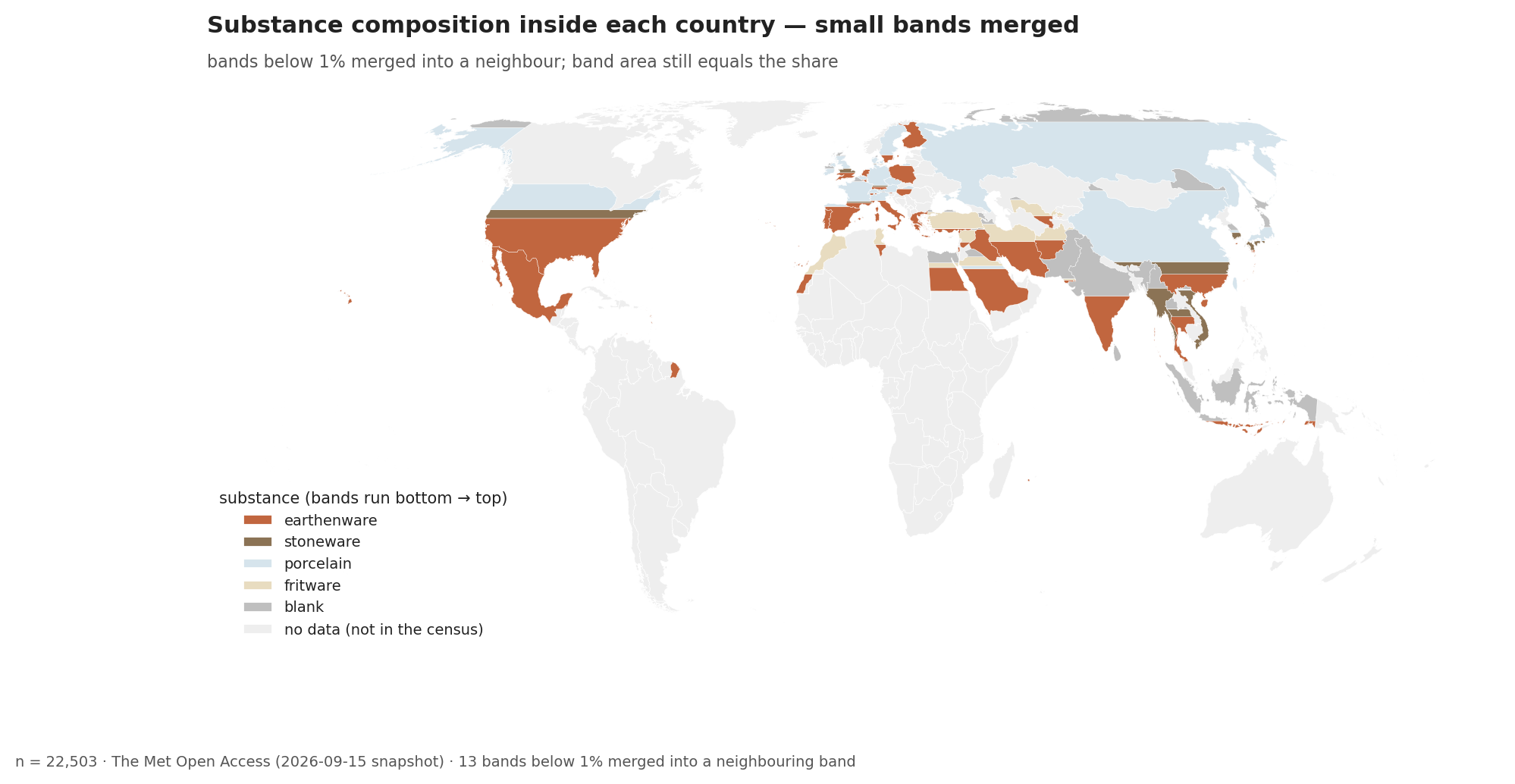 fig02a — each country divided into bands by body type. Bands under 1% are joined to the band next to them, so the area of a band still equals its share.
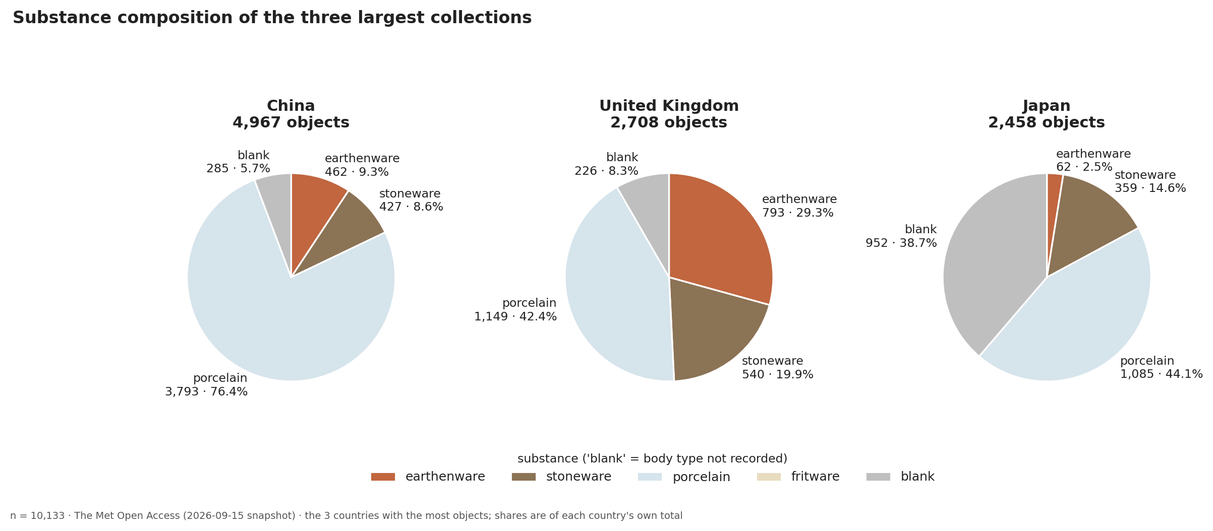 fig02c — body types in the three largest collections. Porcelain leads in all three. Japan’s second-largest slice is “not recorded.”
Glazes and decoration
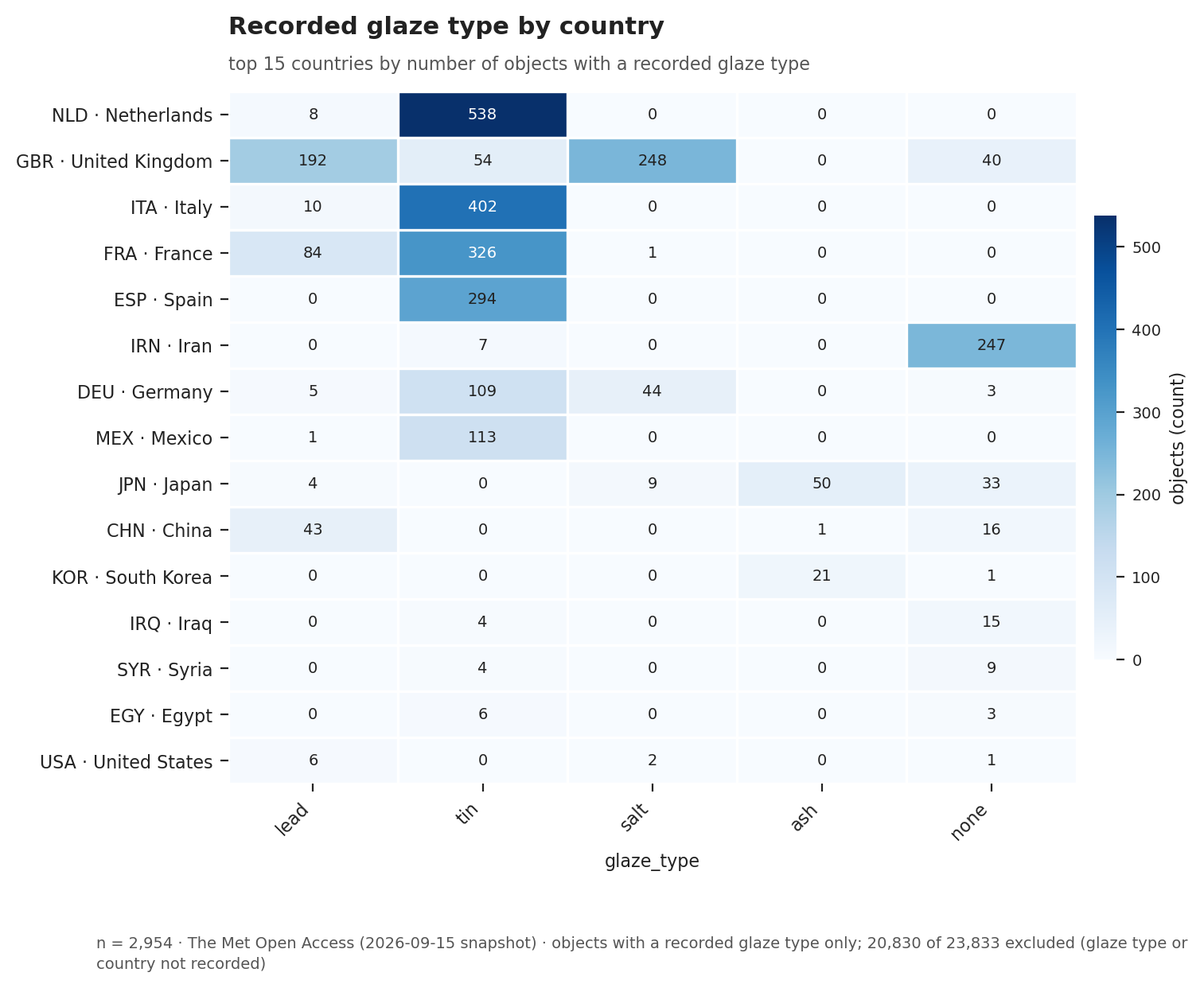 fig03 — recorded glaze type by country. Tin glaze dominates and sits almost entirely in Europe. This says less about glaze itself and more about which of our six vocabulary words matched the way The Met writes.
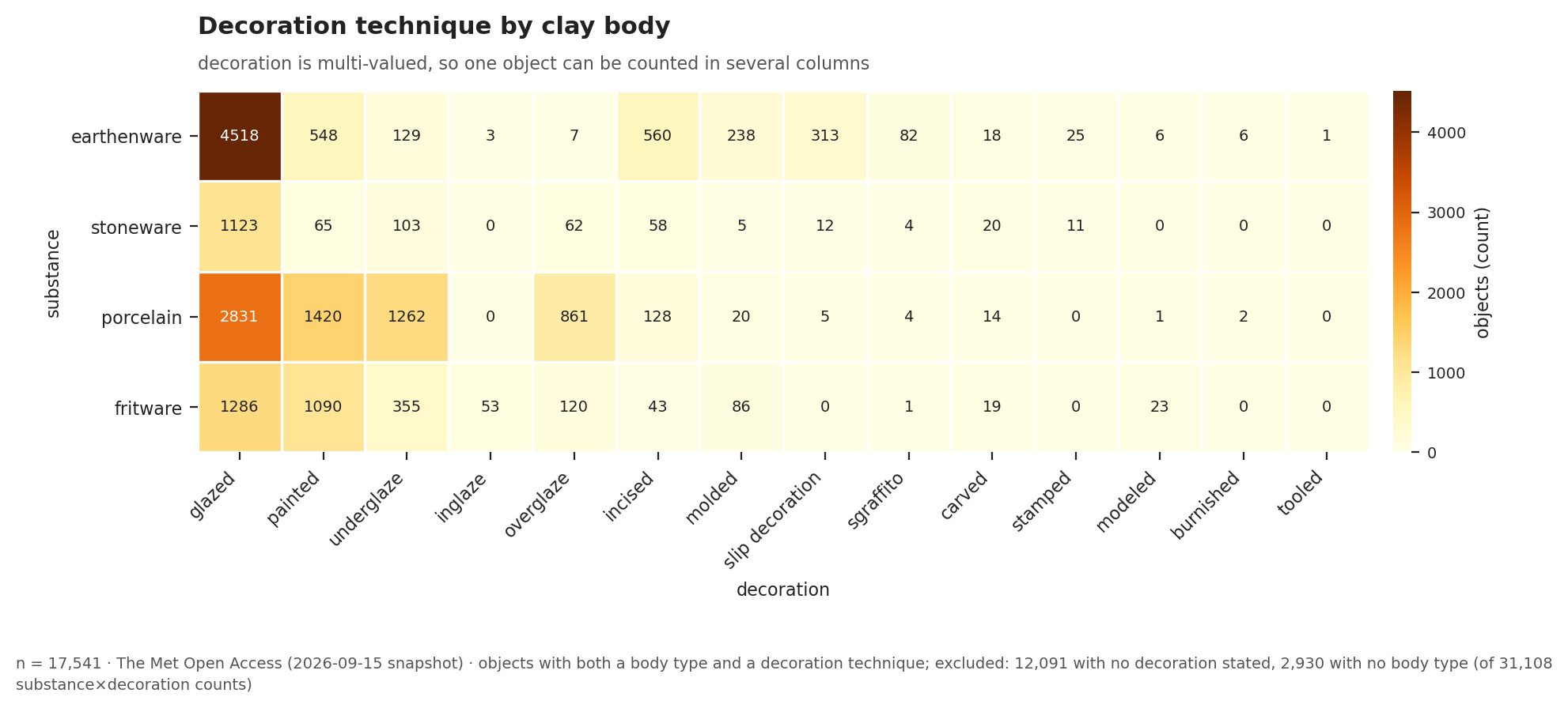 fig04 — decoration technique by clay body, as counts. The “glazed” cell for earthenware is so large that it hides everything else. That is the weakness of counting.
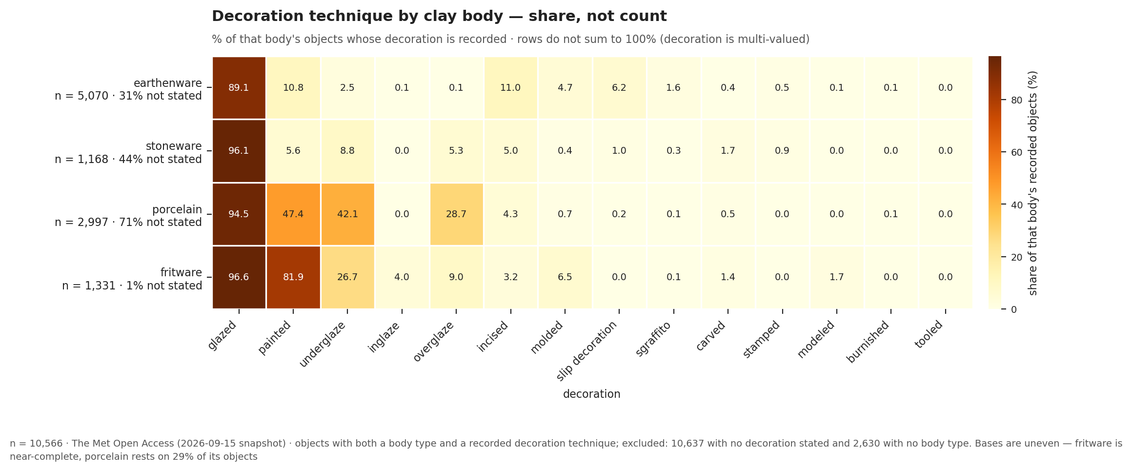 fig04b — the same table as percentages. Once the numbers are balanced, the real finding appears: porcelain varies in where the pigment sits, while earthenware is the body that is actually carved and stamped.
Time
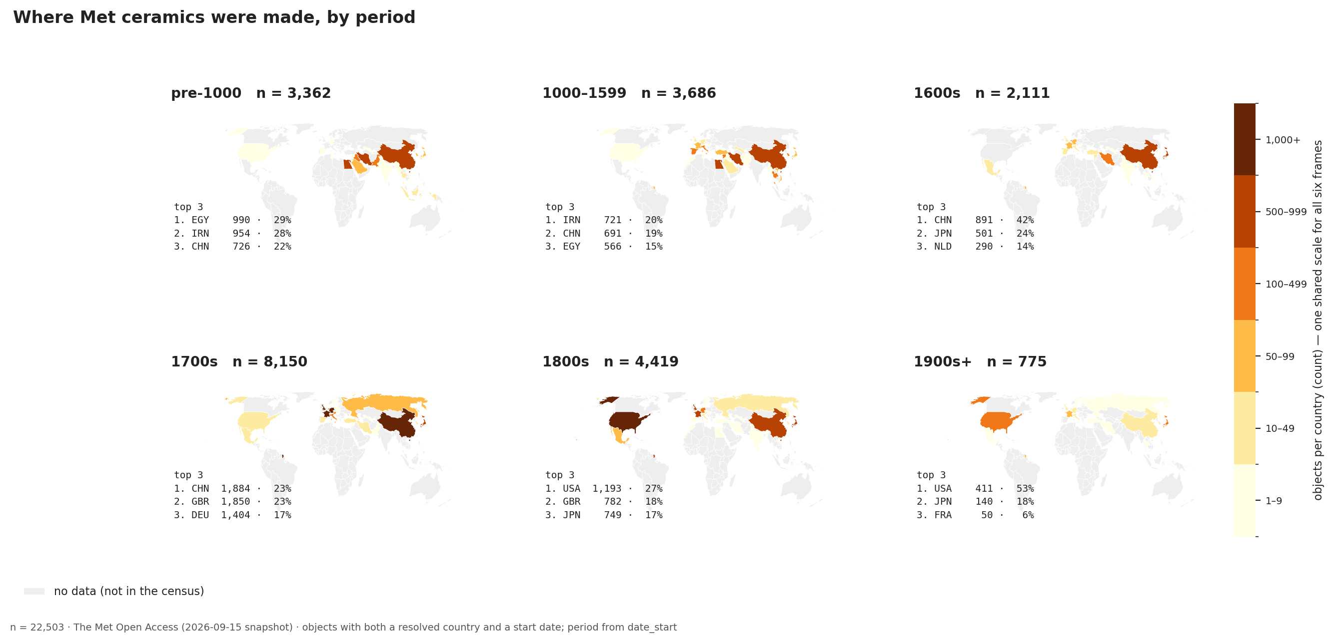 fig05 — six maps, one for each period. The center moves from the Middle East to East Asia, then to Europe, then to the United States.
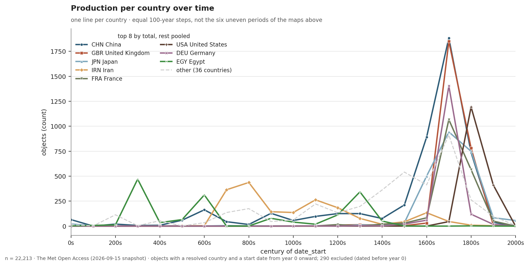 fig05b — one line per country, in equal 100-year steps. The 18th-century jump is very clear.
References
Readings
- Rawson, Philip. “Techniques.” In Ceramics. University of Pennsylvania Press, 1984. jstor.org/stable/j.ctt3fhsg5.6
- Miller, Sequoia. “Ceramic Art: An Introduction.” In Ceramic Art, by Margaret S. Graves, Sequoia Miller, Magdalene Odundo and Vicki Parry, edited by Caroline Fowler and Ittai Weinryb. Princeton University Press, 2023. jstor.org/stable/j.ctv360nrvm.4
- Munger, Jeffrey, and Alice Cooney Frelinghuysen. “East and West: Chinese Export Porcelain.” The Metropolitan Museum of Art, October 1, 2003. Source of the ballast detail in section 3. metmuseum.org/essays/east-and-west-chinese-export-porcelain
Data
- The Met Open Access (CC0), 2026-09-15 snapshot. 23,833 ceramic objects after filtering. All figures count what the museum holds, not what was produced.
- The ballast detail in section 3 comes from the Munger and Frelinghuysen essay listed above, not from the dataset.